Axure Prototype—Online Trading Dashboard
Click image to access prototype
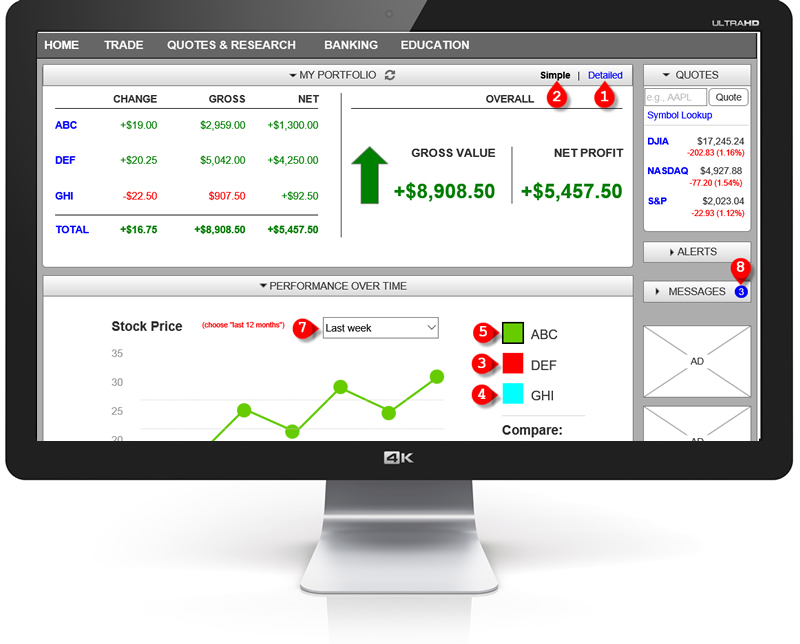
Project Description
The consumer-facing dashboard of my online trading platform is completely cluttered and clunky with virtually unusable information. I always like to have an overall view of how my stocks are doing today as well as as compared to my original purchase price, but to get that, I had to memorize a series of nonintuitive steps. I decided to undertake to simplify it with the most important information prominently displayed. It includes an interactive graph where the user can view the performance of each stock separately, or compare a stock with various indices, such as the Dow. It also has collapsible pods, which I will eventually made draggable. This was created for my portfolio.